After some years of service this blog is ready for retirement. It was a great pleasure and is by no means the end of my image-making. In order to keep up to date please visit (and subscribe to) my page on facebook: www.facebook.com/paulscheruebel/
My warmest regards and all the best!
Sunday 23 April 2017
Saturday 8 April 2017
Illustrated 2017
I'm thrilled to be part of Illustrated 2017. It's a great occasion to see my dear London again and meet with some super-hot illustrators and street artists. If you have the chance to come I'd be delighted.
In the meantime be nice to each other!

In the meantime be nice to each other!

Saturday 8 August 2015
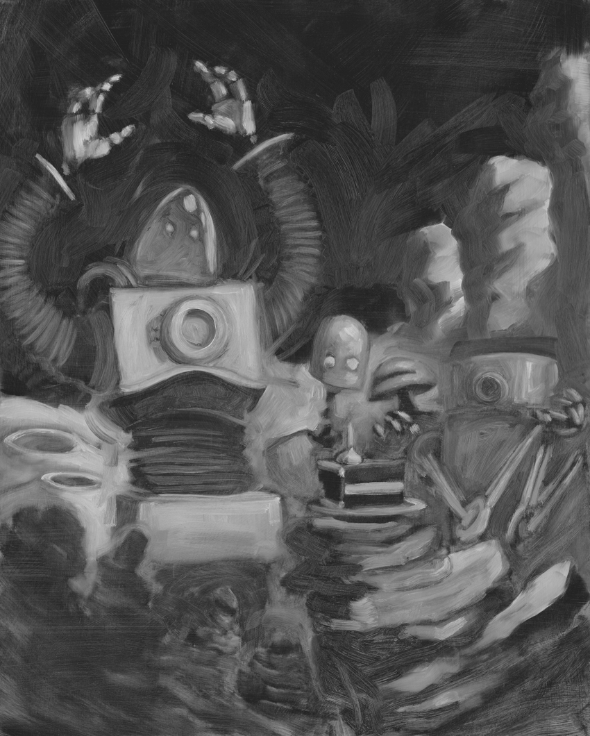
Process Steps
Some time ago I did a little experiment with digital tools on top of a painting. That was a very interesting endeavour and I thought you guys might like to see some steps along the way. I usually try to keep reproductions of my paintings very true to the original but it's always good to try something new.
So.
In the beginning there was the sketch.
And the sketch was without form, and void; and darkness was upon the face of the deep.
Which looked like these two squiggles here. There were many many many more.


The lower one of the thumbnails was the one I decided to go with. From that idea I did a very rough painting that I scanned in greyscale.
 As you can see it is kind of hard to even tell what's depicted. The contrasts are poor and the texture of the paint too harsh. So I did some first corrections for that in Photoshop.

The analog painting was then used as a skeleton of sorts. All the basic things I needed to know were already defined and I could give the image its final appearance by painting over it, blending, erasing, ... All the pleasures of working digitally really. Here you see the result.

I left it in greyscale to retain the retro-sci-fi feel.
I hope you enjoyed this. If you would like to see more process documentations, perhaps a bit more detailed than this one, feel free to leave a comment either here or over on Facebook.
So.
In the beginning there was the sketch.
And the sketch was without form, and void; and darkness was upon the face of the deep.
Which looked like these two squiggles here. There were many many many more.


The lower one of the thumbnails was the one I decided to go with. From that idea I did a very rough painting that I scanned in greyscale.


The analog painting was then used as a skeleton of sorts. All the basic things I needed to know were already defined and I could give the image its final appearance by painting over it, blending, erasing, ... All the pleasures of working digitally really. Here you see the result.

I left it in greyscale to retain the retro-sci-fi feel.
I hope you enjoyed this. If you would like to see more process documentations, perhaps a bit more detailed than this one, feel free to leave a comment either here or over on Facebook.
Thursday 11 September 2014
Sports, Food, Fear and Trembling
Many thanks to everyone who dropped by to see the private view of my show "Sports, Food, Fear and Trembling" at the Landhaus in Graz. I really enjoyed the evening and I am very grateful that I was invited to exhibit there.
You can still come and see it until the 17th of October. The opening hours are monday to thursday 9.00 until 16.30, friday 9.00 until 13.00.
Here are some impressions of the opening night.


You can still come and see it until the 17th of October. The opening hours are monday to thursday 9.00 until 16.30, friday 9.00 until 13.00.
Here are some impressions of the opening night.
Wednesday 13 August 2014
Let's put up a show!

This September I will be having a show in Graz at the Landhaus. A most beautiful place to exhibit some work, right at the heart of the city. Preparations are going well and I hope to see many friends and visitors there. So please do feel invited.
Saturday 15 February 2014
Abraham and me
The Folio Society did an interview about the illustrations for Fear and Trembling with me. I highly recommend their books and a visit on their website. The original interview was posted on their blog 'Footnotes'. I want to thank them again for a beautiful project!
Illustrating Fear and Trembling
Paul Scheruebel’s illustrations for our edition of Kierkergaard’s Fear and Trembling are some of the most unconventional and arresting in our latest selection of books. Scheruebel has taken the central image of this work (the Voice of God commanding Abraham to kill Issac) and re-imagined and reconstructed it seven times, mirroring Fear and Trembling‘s narrative structure in which Kierkergaard debates and questions this scene from the Bible from different angles. We interviewed Paul Scheruebel to find out more about this fascinating project.

How did you first get involved with this project?
I had been interested in The Folio Society for years and I was quite keen to illustrate one of their books. I was actually just working on some pieces for the ‘Brave New World’ competition when I received an E-Mail from Sheri Gee (Folio’s Art Director), asking me whether I was interested in illustrating Fear and Trembling. It was a pure coincidence but the timing was perfect to give me quite a surprise. Obviously I said yes. Sheri had already thought about a basic concept for the illustrations together with the editor and it sounded absolutely fascinating.
Had you read Kierkegaard before and what were your concerns (if any) in illustrating a work of theological philosophy?
No, I had not read him before. It was a good opportunity to do so. I would not say that I was concerned. Luckily there is this scene of the binding of Isaac which he uses a lot in the book. That provides a very good visual theme for an illustrator to work with.
The initial painting is a striking image of the Voice of God, Isaac and Abraham – is this a re-imagining of another painting or an image you created yourself? What research did you carry out for this work and from what sources did you draw inspiration?
I looked at classical versions of the topic a lot. It has been done by Rembrandt, Titian, Caravaggio and so on. My first roughs and attempts at the painting were very much inspired by those. The classical composition and my attempts to execute the painting in a way that hinted at old master paintings did not quite work though and it was a difficult process getting my images to have the right feel for the book. So in the end there was not much of my initial efforts visible in the paintings except, perhaps, a certain sense of staged drama, which is an aspect of old master paintings that I find very intriguing.

Throughout the series the initial painting is deconstructed until it is almost rectangular blocks of paint. How did you decide the stages of this deconstruction? Is there a thematic difference between each image relating directly to the text or is this a progression?
When I first started thinking about how the images would relate to the text and to each other I thought I would try to show the process of Abraham’s letting go of his most treasured worldly possession, so to speak. I thought I would first make the scene very brutal and bleak and then shift the focus from the sacrificed son to the redeeming power of god. In the end everything would be restored in light and glory. Conceptually that would have reflected Kierkegaard’s interpretation really well but when I started sketching out the images I found it seemed too calculated, too predictable. Also, each image had to be a strong image in its own right so the series would not be too repetitive. There had to be a reason for readers to be interested in what the next image would be like, so there had to be room for surprise. It became clear that the series would have to be more experimental and more fluid. Sheri was very helpful there. Working with her was wonderful; she is so art-minded and gave very profound and inspiring feedback. So it became an obsessive painterly treatment of the subject matter, just as Kierkegaard’s text is an obsessive intellectual treatment of it. I painted quite a few more pieces than those that went in the series. That way I could choose from a broad selection and edit together a set of paintings that made an interesting progression towards disintegration. The series now reflects a movement away from the physical reality of the event towards a less tangible, less dense spiritual idea.
Could you explain a little of the process of building a series like this? Did you begin each painting from scratch? Did you start from sketches and rough drafts before building towards the painting or did you go straight to the canvas?
Once the overall idea was formulated and the initial rough was confirmed it was a matter of painterly exploration. The beautiful thing about painting the same motive many times is that you really get to know the image. That gives you an ever greater sense of freedom. The variations in the images came from variations in the process. I did not do sketches for the individual pieces but rather tried to come up with as many different ways of executing it as possible without losing the sense that they belong to the same family. Some paintings that I was quite pleased with did not make it into the final selection simply because they would not fit in and break the continuity. It was a very playful and enjoyable challenge.

You paint your work on a large scale, what were your concerns about how large images would look when reduced for a book and how did you prepare for this in the work? What special considerations do you need to take into account when working on a book commission?
Actually I paint on such a scale precisely because I think the images look good when they are reduced in size. The format allows me to be spontaneous and gestural and still achieve a certain degree of detail in the end format. I like the textures and the energetic strokes you get from painting in a larger format, they come out really nice when they are printed in a book.
If you could illustrate any book which would you choose?
It would be either ‘Blood Meridian’ by Cormac McCarthy or anything by H. P. Lovecraft.
Illustrating Fear and Trembling
Paul Scheruebel’s illustrations for our edition of Kierkergaard’s Fear and Trembling are some of the most unconventional and arresting in our latest selection of books. Scheruebel has taken the central image of this work (the Voice of God commanding Abraham to kill Issac) and re-imagined and reconstructed it seven times, mirroring Fear and Trembling‘s narrative structure in which Kierkergaard debates and questions this scene from the Bible from different angles. We interviewed Paul Scheruebel to find out more about this fascinating project.
How did you first get involved with this project?
I had been interested in The Folio Society for years and I was quite keen to illustrate one of their books. I was actually just working on some pieces for the ‘Brave New World’ competition when I received an E-Mail from Sheri Gee (Folio’s Art Director), asking me whether I was interested in illustrating Fear and Trembling. It was a pure coincidence but the timing was perfect to give me quite a surprise. Obviously I said yes. Sheri had already thought about a basic concept for the illustrations together with the editor and it sounded absolutely fascinating.
Had you read Kierkegaard before and what were your concerns (if any) in illustrating a work of theological philosophy?
No, I had not read him before. It was a good opportunity to do so. I would not say that I was concerned. Luckily there is this scene of the binding of Isaac which he uses a lot in the book. That provides a very good visual theme for an illustrator to work with.
The initial painting is a striking image of the Voice of God, Isaac and Abraham – is this a re-imagining of another painting or an image you created yourself? What research did you carry out for this work and from what sources did you draw inspiration?
I looked at classical versions of the topic a lot. It has been done by Rembrandt, Titian, Caravaggio and so on. My first roughs and attempts at the painting were very much inspired by those. The classical composition and my attempts to execute the painting in a way that hinted at old master paintings did not quite work though and it was a difficult process getting my images to have the right feel for the book. So in the end there was not much of my initial efforts visible in the paintings except, perhaps, a certain sense of staged drama, which is an aspect of old master paintings that I find very intriguing.
Throughout the series the initial painting is deconstructed until it is almost rectangular blocks of paint. How did you decide the stages of this deconstruction? Is there a thematic difference between each image relating directly to the text or is this a progression?
When I first started thinking about how the images would relate to the text and to each other I thought I would try to show the process of Abraham’s letting go of his most treasured worldly possession, so to speak. I thought I would first make the scene very brutal and bleak and then shift the focus from the sacrificed son to the redeeming power of god. In the end everything would be restored in light and glory. Conceptually that would have reflected Kierkegaard’s interpretation really well but when I started sketching out the images I found it seemed too calculated, too predictable. Also, each image had to be a strong image in its own right so the series would not be too repetitive. There had to be a reason for readers to be interested in what the next image would be like, so there had to be room for surprise. It became clear that the series would have to be more experimental and more fluid. Sheri was very helpful there. Working with her was wonderful; she is so art-minded and gave very profound and inspiring feedback. So it became an obsessive painterly treatment of the subject matter, just as Kierkegaard’s text is an obsessive intellectual treatment of it. I painted quite a few more pieces than those that went in the series. That way I could choose from a broad selection and edit together a set of paintings that made an interesting progression towards disintegration. The series now reflects a movement away from the physical reality of the event towards a less tangible, less dense spiritual idea.
Could you explain a little of the process of building a series like this? Did you begin each painting from scratch? Did you start from sketches and rough drafts before building towards the painting or did you go straight to the canvas?
Once the overall idea was formulated and the initial rough was confirmed it was a matter of painterly exploration. The beautiful thing about painting the same motive many times is that you really get to know the image. That gives you an ever greater sense of freedom. The variations in the images came from variations in the process. I did not do sketches for the individual pieces but rather tried to come up with as many different ways of executing it as possible without losing the sense that they belong to the same family. Some paintings that I was quite pleased with did not make it into the final selection simply because they would not fit in and break the continuity. It was a very playful and enjoyable challenge.
You paint your work on a large scale, what were your concerns about how large images would look when reduced for a book and how did you prepare for this in the work? What special considerations do you need to take into account when working on a book commission?
Actually I paint on such a scale precisely because I think the images look good when they are reduced in size. The format allows me to be spontaneous and gestural and still achieve a certain degree of detail in the end format. I like the textures and the energetic strokes you get from painting in a larger format, they come out really nice when they are printed in a book.
If you could illustrate any book which would you choose?
It would be either ‘Blood Meridian’ by Cormac McCarthy or anything by H. P. Lovecraft.
Friday 14 February 2014
New Website
Today I finished my new website! I'd be delighted if you paid me a visit there, left a comment and spent some time with my images.
Go to http://paulscheruebel.com/ and check it out! The old web address (www.paulscheruebel-art.com) still works, too. It will take you to the same place. I wish you a good start into the weekend!

Go to http://paulscheruebel.com/ and check it out! The old web address (www.paulscheruebel-art.com) still works, too. It will take you to the same place. I wish you a good start into the weekend!
Subscribe to:
Posts (Atom)
